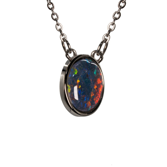
Colour Aberration in Opal
07 Sep 2021
An Explanation of Opal Colour
The explanation for why the play of colour on black opal is brighter than the play of colour on white opal is simple: because of the colour aberration, or contrast of colour.
A good way to explain this occurrence is to think of chalk on a blackboard. Blackboards are usually dark green or black, which allows a contrast which is easier on the eye. The question I am going to address is summed up as “How does the medium of opal affect light and how does light act inside the medium of opal?”
We will start with Black Opal.
How do the spectral colours of red, orange, yellow, green, blue, indigo and violet react with black Opal and how does the human eye perceive and interpret that reaction?
In order to understand the colour in opal, we must first understand light. Colours are composed of white light, and change as they pass through different media and are perceived. As the light moves, it must pass through what is known as its ‘diffraction grating’, which can best be described as a shoe box packed with table tennis balls in groups of different sizes. The spheres you are imagining actually range from 115 to 400 nanometers. Remember that there are one million nanometers to a millimeter. So what happens to the rays of light as they pass a diffraction grating? In the sections of the spheres that are smaller, the 115nm end, the colour with the shorter wavelengths predominate and the emerging colour is blue. At the other end of the size range of the spheres the larger spheres at 400nm bend the light with the larger wavelengths and we see red.
This begs the question: why do we see the red orange yellow green blue indigo and violets. How can there be such a dramatic colour contrast against the black base colour of black opal?
In the Red Green Blue (RGB) colour system the exact opposite of blue is yellow. So blue emerges as the stronger colour when yellow is absorbed by blue. In fact, the name ‘black opal’ can be deceiving, as it is actually blue; that’s what black opal is, only, our eyes do not perceive that part of the electromagnetic spectrum, the ultra-violet light.
The colours that form opposite positions on the colour wheel are called ‘Complementary Colours’. Colours such as red and orange, yellow and violet, blue and yellow, red and magenta are complementary. When one wavelength is absorbed, usually because of the size of the hydrated silica spheres, then the complementary colour survives and is bent or diffracted. This can be seen in the case of green red opal, we will see a brighter red. This is how the brighter colour with the differing wavelength is intensified by electromagnetic energy to make it more intense.


